Mississippi College Introduces New Athletic Logo, Refreshed Brand Mark
Mississippi College Homecoming attendees may have noticed an enhanced version of the University’s iconic brand mark and a vibrant new athletic logo when they visited the Clinton campus last month.
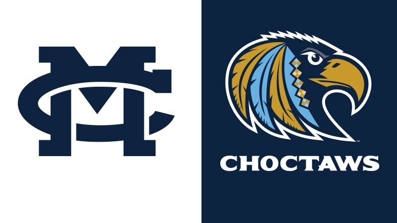
The traditional MC letters have received a nuanced adjustment, with clean, symmetrical lines, sharp, thin edges, and a more modern look. The new colors are a richer version of the beloved blue and gold.
The athletic logo is more striking: a stylized profile of an eagle – an important animal in the culture of the Choctaw people – adorned with feathers modeled after those prominently displayed in the crowns of Choctaw Indian Princesses. The feathers are offset by diamond shapes commonly found in handmade jewelry or woven baskets crafted by Choctaw artisans.
The refreshed look, part of a new branding initiative at the 197-year-old Christian University, is intended to appeal to a new generation of students, according to Nick Stafford, director of marketing at MC.
“The rebrand was necessary to help make certain elements of MC’s look more cohesive,” Stafford said. “A single brand message strengthens not just how the University looks, but communicates who the University is. Uniformity is essential in messaging, from email signatures to external signage to T-shirts and athletic apparel.
“The rebrand is reflective of changes that are happening at the operations level of the University. We’re growing and striving to reach the next generation. We want to take strategic steps to reflect those changes that speak to that generation of students.”
The new brand mark is not exclusive to the main campus in Clinton. Stafford said the new branding initiative will also apply to the MC School of Law campus in downtown Jackson.
“We’re a multi-site University, and this is a footprint-wide brand change,” he said.
Homecoming presents the perfect opportunity to unveil the design changes because it represents the largest gathering of current and former faculty, staff, students, families, and friends of the University.
“They’re coming back to a place where, for many of them, core memories were made,” Stafford said. “It’s where they learned who they are; it’s where they made so many of their friends; it’s where many of them met their spouses. All those things happened, not just at some geographic location, but as part of a shared experience with the MC brand.
“It’s important for our alums to see this rebrand because it’s the next evolution of something their lives are tied to. It’s the next step on the ladder that reaches generations.”
During Homecoming, the new brand mark will appear on signs and banners on campus, T-shirts, tailgate tents, postcards, stickers, MC’s official website.
“We expect this branding initiative to be a long runway,” Stafford said. “It is one of many steps we are taking towards MC’s bicentennial, which will be a big celebration at the University.”
He said the changes to the brand mark were intended to be subtle – upon first glance, many individuals may not notice a difference.
“The new brand mark looks remarkably similar to the one that has existed for a number of years,” Stafford said. “The refreshed design is intended to be nuanced. It’s something that honors the history of MC’s letters.”
The athletic logo, on the other hand, was purposefully different.
“We needed a logo that our athletic teams could get behind, could be proud of, and could easily understand its meaning and history. We did not come up with the design on our own – it’s a reflection of our recently invigorated partnership with the Mississippi Band of Choctaw Indians.
“We had a concept in mind, and presented the logo to the MBCI. With their great blessing, we have this logo, which is an homage to our partnership and reminds everyone associated with MC of the strong and deep connection the University has with the Mississippi Band of Choctaw Indians.”
The athletic logo introduces a new color into the traditional MC blue and Choctaw gold palette: celestial blue.
“That color has been used sparingly in the past since it’s a shade of MC’s traditional blue, but it has never been an official part of our brand until now,” Stafford said. “Color-wise, it gives our logo a lot of depth.”
MC’s faculty and staff were treated to an “internal reveal” of the new brand mark during Convocation last spring. Stafford said the responses to the redesign were overwhelmingly supportive.
“Multiple faculty members have shared their comments about the logo,” he said. “The vast majority were positive about elements of the logo and the new direction of the brand. Many of them expressed excitement about the effort.”
Throughout the excitement of the new branding initiative, one “big” question remains: what will become of the large MC letters that have become a popular “selfie” spot on Pedestrian Street? Stafford said they will be replaced with letters reflecting the new insignia.
“The current plan is to auction the current letters off to the highest bidder,” Stafford said. “Anyone interested in purchasing them is welcome to bid.”
To bid on the MC letters, visit https://www.mc.edu/homecoming/mc-letters-auction.
Sign-up For Our Newsletter
Get the latest news about Mississippi Christian University delivered right to your inbox by subscribing to the Along College Street e-newsletter.