A picture is worth a thousand words…so let the logo speak clearly.
The MC logo is the gateway to our brand and the most visible element of our communications. It identifies and speaks for us when we’re not present to convey who we are, acting as a silent ambassador for our brand. The consistency of the application of our logo is paramount to our identity.
Logo Color Variation
Primary Color Usage
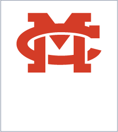
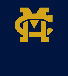
MC’s logo is available in 3 color options suitable for use in most situations: PMS 289 Blue, PMS 117 Gold and White. The same color variation usage guidance applies to all configurations of the logo.
The PMS 289 logo should be used over light background colors, including images. When using the logo over dark colors or images, the white version is to be used.

Logo Sizing
To ensure the logo is easily seen and read, the M mark should never be reproduced smaller than .75″ wide.
![]()
Logo Spacing
The MC logo should never be “lost in the crowd.” Maintaining a minimum amount of space around the logo allows the logo “breathing room” and ensures it will never be overshadowed or difficult to see and recognize immediately.
Use the space between the descenders of the M as a guide and maintain this "M Space" around the logo.
![]()
Maintaining a clear message means using MC's brand the right way.
Below is a sample of ways MC's brand should never be used. If you have any questions about logo usage, reach out to one of our marketing team members.
Logos featuring the Mississippi Christian University name should no longer be used in applications that are expected to be visible after June 1, 2026.

Logo elements should never be reproduced in any other color or combination of colors than those identified in this manual.
Logo elements should never be slanted, made to fit a shape, or manipulated in any way.

Logo elements should never be condensed or expanded.
Special effects (filters, posterization, unusual screens, etc.) should never be applied to the logo components.
The logo should not appear on distracting or busy backgrounds.

The logo mark should never be used to create a repeated closed pattern.

Do not fill the logo with patterns.

School and Department Lockups
The names of MC schools, departments, programs, and administrative offices must always appear in conjunction with the MC logo mark. Creating a strong institutional identity for the university requires a consistent approach to identifying the numerous schools, departments, and offices campus-wide. Uniquely constructed logos are not permitted for any academic, administrative or other unit.
Generally, the horizontal lockup is preferred, although there may be instances where the vertical lockup is more appropriate. Note that these examples are some of the very few cases where the MC logo "safe space" is smaller than required on all other applications. Please contact the office of Marketing & Communication for approved lockups.